June 11, 2018
Kips Bay vs Everyday
One of my favorite aspects of being a designer is the opportunity to attend events, shows and CEU’s to track trends. A few weeks ago, I was fortunate enough to steal some time and attend the highly coveted Kips Bay Decorator Show House. An annual event, Kips Bay is the gold standard of society interior design events.
The most dominant theme was the renewed appreciation of historic styles and antiquities woven quite dramatically into each designer’s unique perspective. While a portion of the upcoming generation is seeking their grandmother’s past, a large portion of the population is still discarding their family heirlooms desirous of a more casual or simpler lifestyle. Kip’s Bay demonstrated the dichotomy of these two lifestyle undercurrents slightly favoring the bygone era of traditionalism. I am pondering when and if these two worlds will intersect. Most importantly when will the social media sites that influence our clients connect with Kip’s Bay. Review my visual comparisons based on the top emerging design trends I identified at Kips Bay and how these trends manifest on Pinterest and Instagram posts.
As an active member of the design community, I look forward to this show every year; what design inspirations I can impart to my clients, where the industry is headed and namely what will the next big lifestyle trend be.
- Neoclassicism:
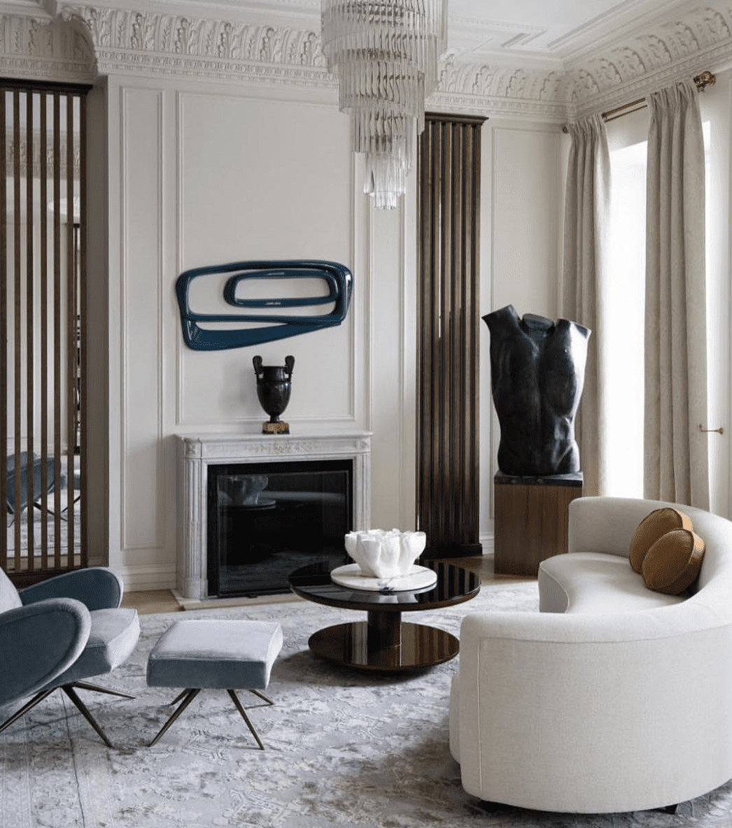
Personally, I have been feeling that this trend is ready for a comeback. The style by Mathison Interiors takes its inspiration from the clean lines and wide-open spaces of Greek and Roman temples. Neoclassicism recognizes modernism with a historical framework. It is understandable, logical and authentic. Alexa Hampton’s tented bedroom, Olympia Folly, is a theatrical nod to Greco-Roman times. A self-proclaimed neo-classicist, Alexa Hampton draped the entire room in a custom wallpaper from de Gournay resembling draped fabric. The ceiling painted by Chuck Fisher completed the Grecian tent along with personal relics from Alexa Hampton’s collection including a Roman-style Helmut and Sword. Trending today is a cleaner neoclassical aesthetic than viewed at Kip’s Bay. Neoclassicism in interior spaces celebrates minimal lines, symmetry and the use of classical materials. Notice the light-filled, pared down interpretation of the Neoclassical trend from Leyla Uluhani Interiors designed for today’s modern luxury market.
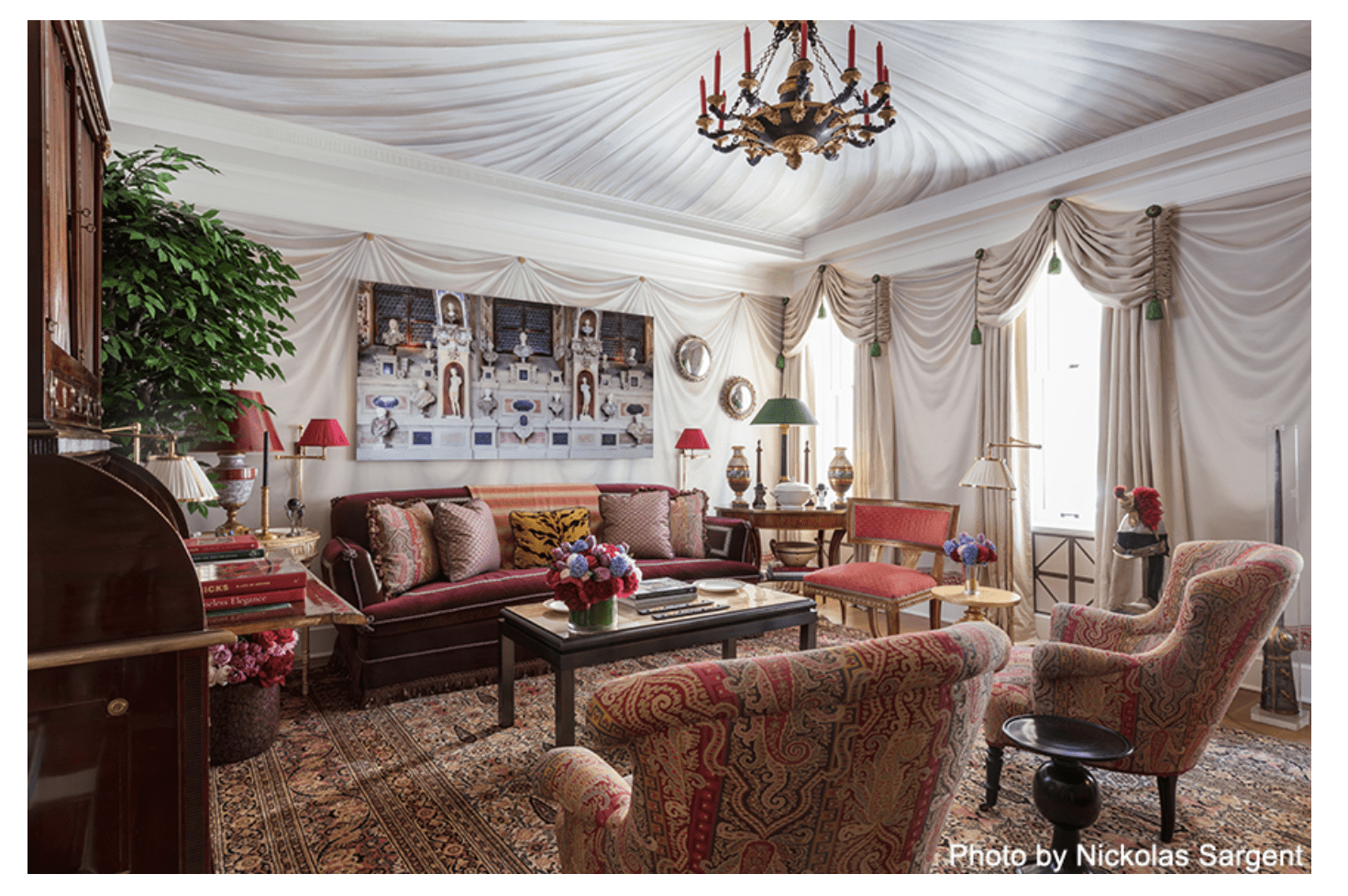
Kips Bay: Alexa Hampton
Every Day: Leyla Uluhanl Interiors
- Storytelling:
As a society, we yearn for the art of conversation. Philip Mitchell’s space is a celebration of yesteryear where time has stopped and only conversation exists. Like Grandma’s attic, the room is brimming with collections. As Philip Mitchell puts it “with things we love”. He relishes the history of family as much as that of objects.
Several collections adorn the room—including pillows, paperweights, blue-and-white Chinese pottery, candlesticks, board games, and art. Prevalent online is the rise of the library room where phones are forbidden, history is a hero, books are sacred and family heirlooms are displayed. I would not be surprised if Philip Mitchell brings back the neglected living room in the years to come.
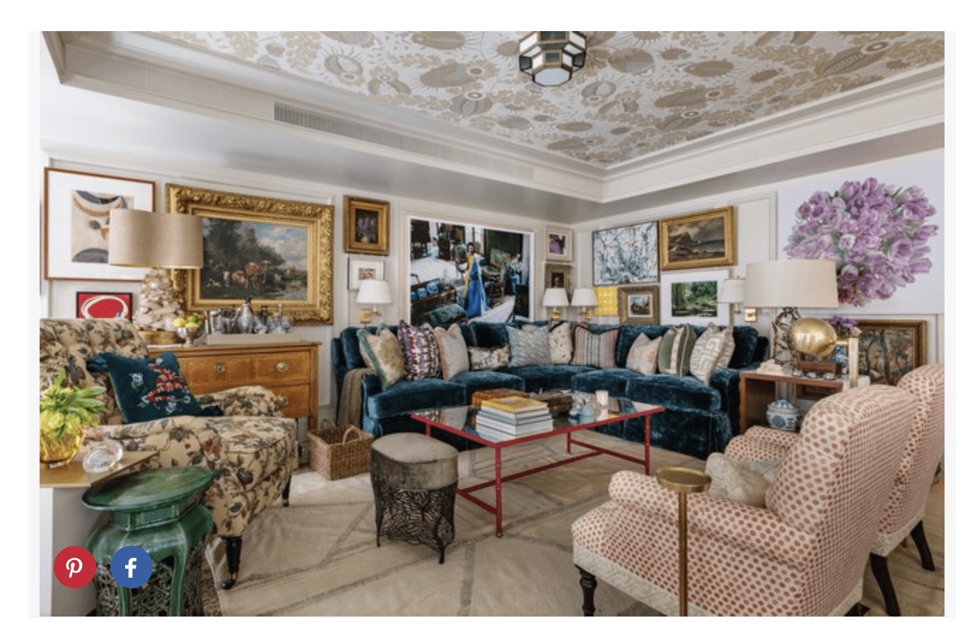
Kips Bay: Phillip Mitchell
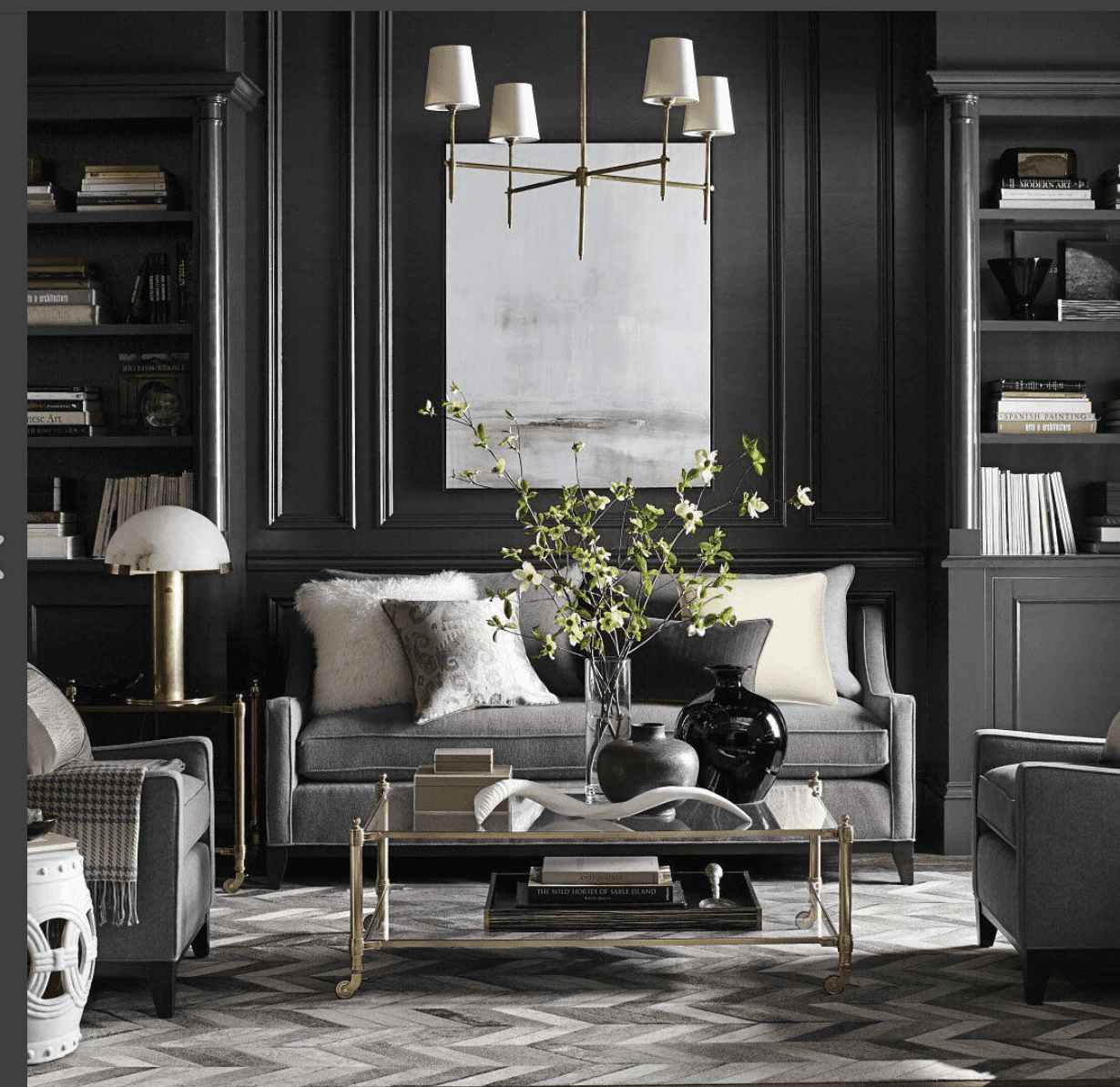
Every Day: Williams Sonoma
- Luxury of Beauty:
Derived from the Wiener Werkstätte Movement and Spearheaded by the infamous group of talented artists including Joseph Maria Olbrich, Josef Hoffmann, Gustav Klimt, & Koloman Moser, this Austrian Decorative Arts Movement aka the Viennese Workshops focused on the highest quality craftsmanship and materials for the socio-economic elite. Gaining in popularity today, this trend celebrates craftsmanship, uniqueness of material and object and artisanal foundry collaboration. A predecessor to the Art Nouveau movement, modernism was born from this aesthetic. Juan Montoya’s basement lounge at Kips Bay boasts many originals and reproductions from that time period including Josef Hoffmann chairs from Montoya’s collection to a chandelier from Koloman Moser as well as Secessionist-style grids on several pieces of furniture. The popularity of this trend in today’s market is less specific than the “Wiener Wekstatte” but encompasses the glamour of all of the early twentieth-century art movements. Kelly Wearstler’s design aesthetic most closely represents this era. I primarily see the influence of this trend on an “item” basis in furniture and accessories rather than fully designed rooms replicating the time period.
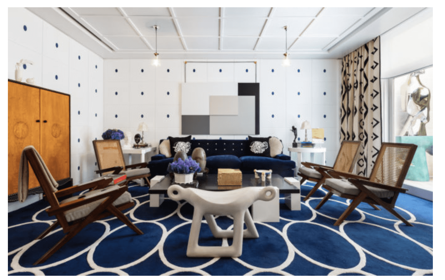
Juan Montoya
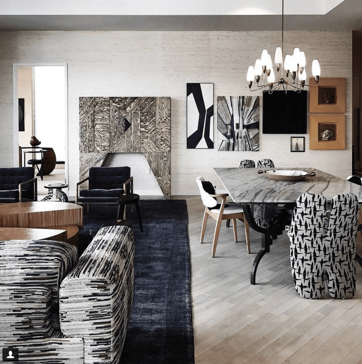
Every Day: Kelly Wearstler, Hollywood Proper San Francisco
- Miami Meets Milan:
Sasha Bikoff’s staircase which embodies the 80’s Memphis Italian design movement was a scene stealer. She juxtaposed Miami style 80’s design with big bold patterns & bright vivid colors against the classical architecture to create a vivid fantasy of kid-friendly forms found in the works of Memphis Milano designers, Ettore Sottsass and Alessandro Mendini. This trend is highly prevalent in today’s market. One of the more interesting approaches that I have seen is Miriam Alia’s 50’s meets 80’s meets Miami, Milan and maybe even Brazil. Her work is strikingly bright and airy, a highly sought after look on Pinterest and Instagram.
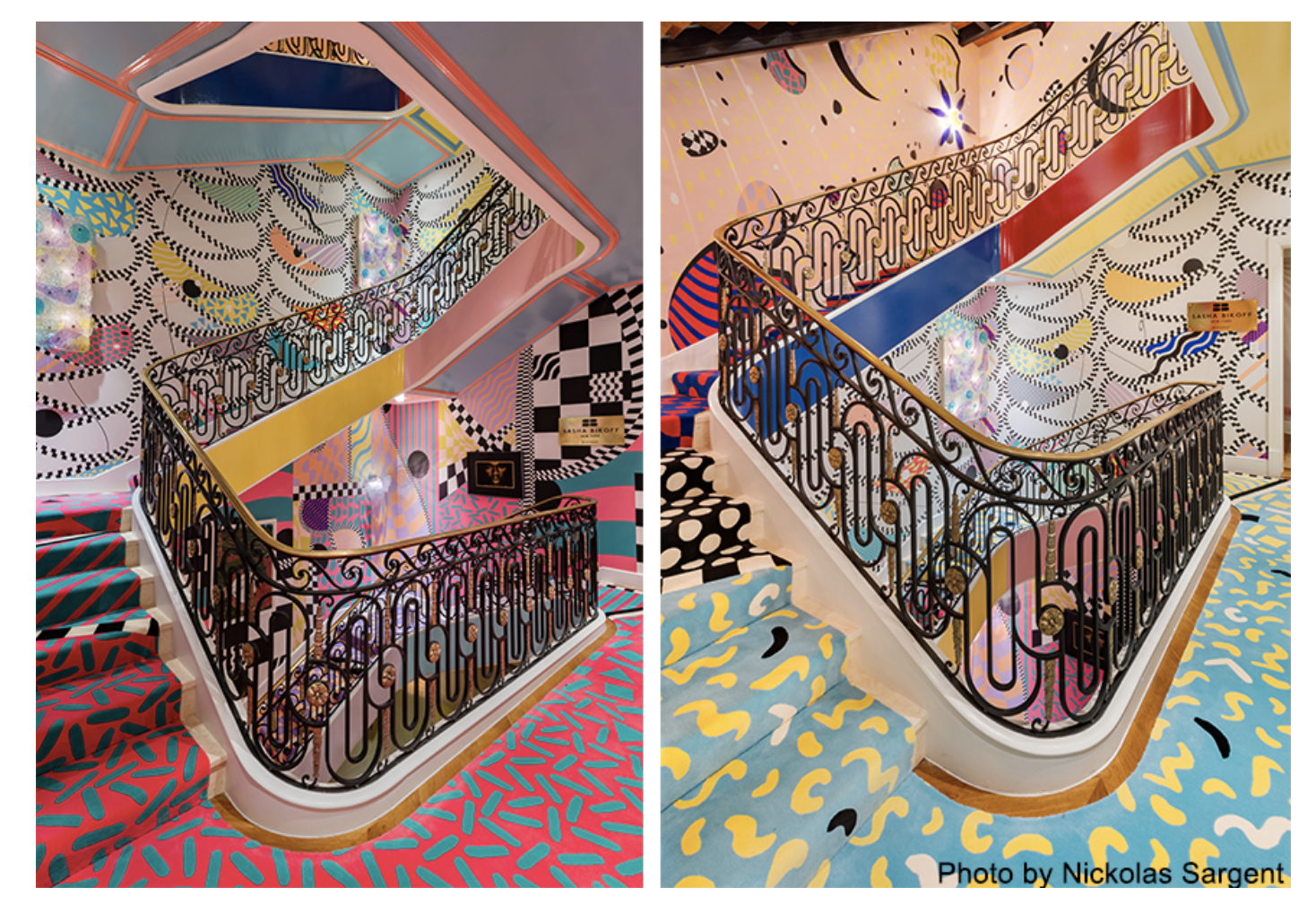
Kips Bay: Sasha Bikoff
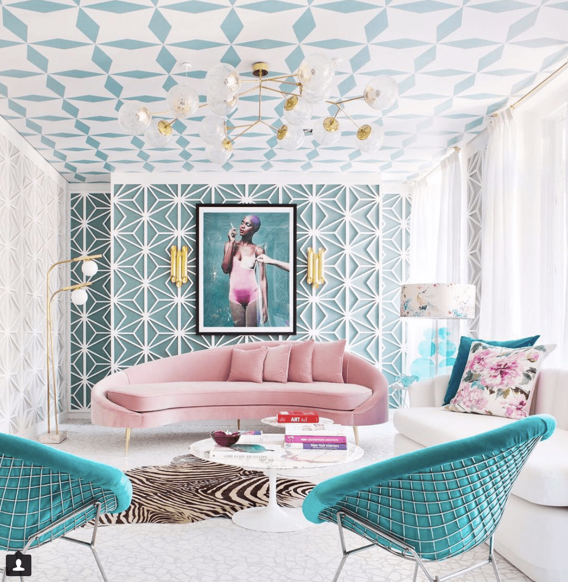
Every Day: Miriam Alia
- English Country Garden:
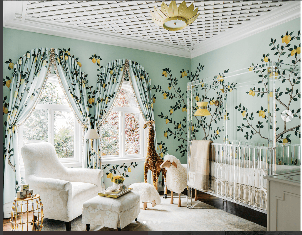
Think Mario Buatto, Laura Ashley, florals, matchy matchy, balloon shades and pastels for more 80’s trends. Sike’s room is called Sleeping Beauty and was designed around his love of blue and the precious. Online we are seeing the New Nursery as an approachable form of Sike’s imagination. The new nursery is a room fit for the babies who brunch and the moms who Instagram. It boasts oversized florals, graffiti wallpapers, beautiful fantasy murals and pretty is a theme topped off with FAO Schwartz life-sized stuffed animals.
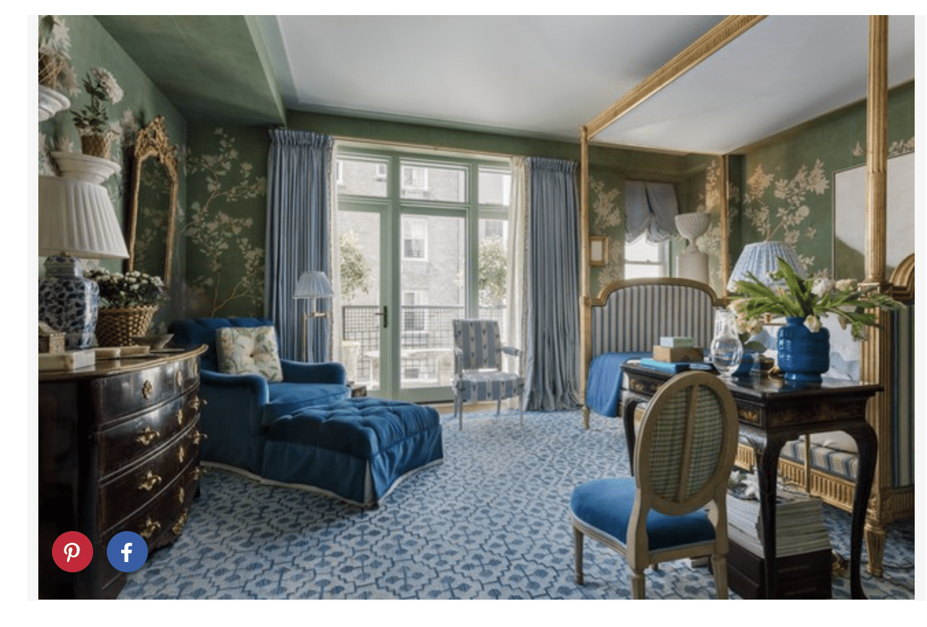
Kips Bay: Bedroom, Mark D. Sikes


 Reviews


