August 14, 2019
Top Designers Are Obsessed with These Brilliant Blue Paint Colors
Because this soothing hue never goes out of style.
by Sarah DiMarco
Blue just may be the most versatile shade on the color wheel. With its diverse range of undertones and ability to pair seamlessly with other hues, this color proves why it is a standout among designers. A rich midnight evokes a more reflective feeling suitable for a home library while a glossy aquamarine exudes just the right amount of energy within a living room. Delicate pastel blue walls can even transform modest bedrooms into peaceful and calming retreats that draw you in.
The relaxing and serene qualities of this hue have even caught the eye of PPG Paints, which announced their brand’s 2020 Color of the Year is a cobalt and moody ink blue called Chinese Porcelain. “The need for simplicity and escapism from technology is, in part, the reason that consumers are craving blues like Chinese Porcelain that bring us closer to natural elements such as the sea and sky—the horizon spot, creating serenity in any space,” explains Dee Schlotter, PPG’s senior color manager.
For inspiration on which blue to choose, we contacted top designers all over the world. One of these sumptuous selections is sure to make it on your walls.
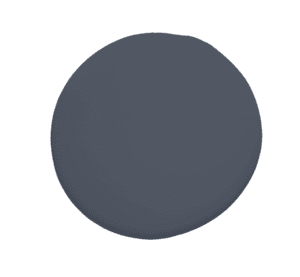
Mysterious by Benjamin Moore

BEN GOLDSTEIN/STUDIO D
“Blue is my go-to color and personal favorite. It has become the new neutral due to its popularity. Like any color, blues have undertones and can travel the spectrum from warm to cool. We mostly use baby blues, gray blues, spa blues, indigos, and navy blues. Benjamin Moore’s Mysterious is an almost-black blue—sophisticated and moody. Think about this color for a butler pantry, powder room, or island cabinets.” — Karen B. Wolf, Karen B. Wolf Interiors
READ THE FULL ARTICLE


 Reviews


