October 2, 2019
Iconic Life: East-Coast Flair Meets Dutch-Inspired Architecture
Read the Article
New Jersey-based designer Karen B. Wolf Interiors demonstrates how to unite Old World and contemporary sensibilities into a cohesive whole that is as functional as it is fashionable.
Whether it is in our clothing, grooming or choice of cars, our generation has long challenged the notion that we have to sacrifice style for practicality when we marry, focus on careers and have kids. New Jersey-based interior designer Karen B. Wolf has not only challenged this in her personal and professional life—opening up her own practice in 2007—but also in her approach to designing living spaces for like-minded clients.

This is expressed in a showcase home she designed for a busy couple with a thriving dental practice and three active young children, like another one we featured in Phoenix. Although she designed other homes and a dental office space for the couple, the goal with the clients’ newer, more spacious property would be to conceptualize it from its framework inward. Like a piece of clever, crowd-pleasing modern art (like many of the pieces now hanging from the home’s walls), it would have as much kid appeal as it would grown-up sophistication.
The first step was to get a fix on what kind of art the frame could hold, figuratively speaking.
“The couple has a strong sense of style and a great eye for design, color and pattern, and wanted a space that would showcase that,” Wolf details. “We found a sweet Pennsylvania-Dutch colonial house that looked old on the outside though it was only a four year-old construction built as an estate on a secluded property. It was very atypical for their location. It was very dark, and it did not have modern lighting as the previous homeowner had it designed to look as if it was built 100 years ago. However, it had amazing bones as well as millwork done by skilled artisans.”
The structure for the house to feel and look modern but at the same time keep the character of the Old World Pennsylvania Dutch charm.
To improve the home’s “frame,” Wolf teamed up with Summit, New Jersey architectural firm Rosen Kelley Conway to open up the spaces and modernize it so you could see from one end to the house to the other, as well as see from the front door to the back door and the beautiful property and the rolling hills making up the backdrop. The ceiling in the foyer was raised to a two-story space to provide a greater sense of openness. Those architectural changes really created the bones and the structure for the house to feel and look modern but at the same time keep the character of the Old World Pennsylvania Dutch charm.
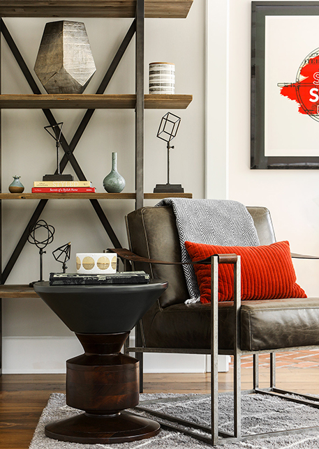
“We wanted to bring in the clients’ sense of fun through pops of color and an energized mix of patterns,” Wolf continues. “In order to make the whole house look unified, we used black and white as the underpinning and then built the interiors out from there. One of the current trends I brought into the project was wide plank wood flooring in a mid-tone. Although the trend now is for light colored floors, and until recently, dark floors prevailed on the East Coast, going with the mid-tone (attained by blending different natural stains until the perfect shade was created) allowed us to keep the backdrop of their decor timeless and classic. It would also enable the couple to update their decor at any point in time so they’re not locked into a specific trend. As the flooring is a very large part of the house, at more than 8,000 square feet, it’s not something that they’re going to want to change on a regular basis.”
Other trends Wolf followed to broaden the frame included lightening up the existing millwork, adding millwork on the dining room ceiling and whitening the walls. While the ceiling beams with a rustic look is a trend, she it added to provide a more authentic Pennsylvania character to the structure. She also enhanced the fireplace, already the focal point of the living room, by having it painted a “barely there black” so it would pop against the white walls and the colorful cushions, artwork, and accessories. According to some visiting the home, the color and modern lighting fixtures gave it a West Coast/California sensibility. However, Wolf argues this take on East-meets-West works for the family’s lifestyle.
“A West Coast sensibility to me is by definition more relaxed,” she says. “There is a more of a welcoming, happy vibe, and a less formal structure that’s family friendly. We couldn’t be too precious with anything that we that we incorporated into the home’s look. However, at the same time, my clients did not want their home to look average and everyday, and the interiors needed to speak to their passion for home entertaining.”
My clients did not want their home to look average and everyday, and the interiors needed to speak to their passion for home entertaining.”
Wolf observes that many family-focused clients find traditional homes not quite in tune with modern times, as some rooms feel redundant, and this holds true for the concept of the “living room.” As her clients saw things, they already had a family room and a den, one of her biggest challenges was to figure out what to do with that extra space from a design perspective. She solved the problem by balancing the dining room on the left side of the first floor of house with the living room on the right to create a ‘wow factor’ for visiting guests. The rooms were then finished with modern-but-glamorous fixtures and accents rich-hued baby sofas and pops of plum and yellow. The final result, to the clients’ delight was a livable classic approach that was also trend-forward in terms of a touch of hospitality world design adapted for a private space. It reminds one of chic bars and restaurants and yet is also comfortable and livable for the family on a day-to-day basis.
I treat all of my homes as a painting and my design process similar to composing a painting. Just as a painting has layers of color and texture, so do homes.
“One of my influences as a designer is fine art, as I started out professionally as a fine artist,” she says. “For this reason, I treat all of my homes as a painting and my design process similar to composing a painting. Just as a painting has layers of color and texture, so do homes. A lot of people think that a design scheme for a home has to be perfect. However, an abstract artist—or any artist–will start a painting with an underpinning and bones for their composition and layer up from there. During the process, she will take a break, stand back, and then make tweaks and weave in colors to achieve a balance for the final work. That’s essentially what we did in this house and what I do with many of my clients’ properties.”


 Reviews


